Quick answer
Gloss paper has the highest shine and the brightest colour, which suits image-led leaflets, flyers and covers, but it reflects light and is harder to read in long passages. Silk is coated too, with a smooth, low-sheen finish. Colours and photos stay sharp but there is less glare, which is why it is the usual all-round choice for brochures and catalogues. Uncoated paper has no coating, so ink soaks in, colours look softer and the sheet feels natural. It is the easiest to write on, which makes it the right choice for letterheads, reply forms and anything the reader needs to fill in.
Key takeaways
- Coated papers (gloss, silk and matt) hold ink on the surface, so colours look brighter and images sharper. Uncoated paper absorbs ink, so the same colour looks more muted.
- Silk is the safest default for brochures, catalogues and mixed text-and-image work: vivid colour without the glare of gloss.
- Choose uncoated whenever the reader will write on the piece, such as response forms, donation slips and letterheads. The higher the sheen, the harder it is to write on.
- Pantone publishes separate Coated (C) and Uncoated (U) guides because the same ink looks different on each stock. Check brand colours against the guide for the paper you will actually use.
- FSC-certified stocks are available across gloss, silk and uncoated ranges, at no extra cost for standard weights.
Silk vs gloss vs uncoated at a glance
The main difference is the coating. Gloss, silk and matt papers have a mineral coating that seals the surface, so ink dries on top of the sheet. Uncoated paper is left open, so ink soaks into the fibres. That one difference changes how colour looks, how easy the sheet is to read and write on, and how it feels in the hand.
| Gloss | Silk | Uncoated | |
|---|---|---|---|
| Finish | High shine | Smooth, low sheen (between gloss and matt) | Natural, no sheen; slightly textured |
| Colour and images | Brightest colour, sharpest images | Vivid colour, sharp images | Softer, more muted colour; images less crisp |
| Reading and glare | Reflects light; tiring for long text | Low glare; comfortable for text and images together | No glare; easy to read |
| Writing on it | Difficult, ink can smudge | Possible with a ballpoint, but test first | Easy with any pen or pencil |
| Feel | Slick and smooth | Smooth and silky | Tactile, natural, often feels thicker for its weight |
| Lamination and spot UV | Works well | Works well | Possible, but coated stock gives a cleaner result |
| Best for | Image-led flyers, posters, photo-heavy covers | Brochures, catalogues, leaflets, reports | Letterheads, reply forms, appeal letters, notebooks, premium stationery |
What about matt?
Matt (or dull) coated paper is coated like silk and gloss but has almost no sheen. Images stay sharp and the sheet is often more opaque and bulky, which suits high-end brochures and photo books. Silk sits between matt and gloss, so if you are deciding between matt vs gloss paper, silk is usually the compromise worth seeing first.
How paper finish changes colour
On coated paper, ink sits on top of the coating with little absorption, so colours stay saturated. On uncoated paper, ink soaks in and spreads slightly, so colours look softer and fine detail loses a little sharpness. X-Rite, which owns Pantone, puts it simply: the same Pantone colour printed on coated and uncoated paper has a quite different appearance, and most of that difference comes from how the ink reacts with the paper.
| Coated (gloss, silk, matt) | Uncoated | |
|---|---|---|
| Ink behaviour | Sits on the surface | Absorbed into the fibres |
| Dot gain (tone value increase) | Lower | Higher, so tones print darker unless the file is prepared for it |
| Pantone guide to check against | Pantone Coated (C), e.g. 185 C | Pantone Uncoated (U), e.g. 185 U |
| Standard print condition (ISO 12647-2:2013) | FOGRA51, premium coated paper | FOGRA52, wood-free uncoated paper |
This is why printers use a different colour profile for uncoated work. Supplying a file converted for coated paper and printing it on uncoated stock usually makes images look darker and flatter than expected. Our pre-press team checks colour profiles on every job and our proofing is calibrated to ISO 12647-2, so the proof reflects the paper you have chosen. Our CMYK vs RGB vs Pantone guide explains colour spaces in more detail.
Matching a brand colour across stocks
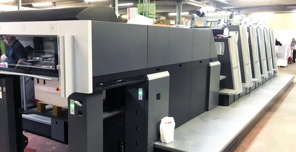
If your letterhead is uncoated and your brochure is silk, specify both the C and U versions of each Pantone colour. Our Heidelberg litho presses print Pantone spot colours, and we can show you a proof on each stock before the run.
Which paper finish should you choose?
| Job | Usual choice | Why |
|---|---|---|
| Brochure or catalogue | Silk | Sharp product images with readable body text and no glare |
| Promotional flyer or leaflet | Gloss or silk | Gloss for maximum colour punch; silk for a more considered look |
| Door drop or mailing insert | Silk or gloss | Strong colour at a lighter weight, which keeps postage and distribution costs down |
| Letterhead and compliment slip | Uncoated | Writes cleanly and runs through office printers |
| Charity appeal letter and reply form | Uncoated | Donors need to write on the form; uncoated also feels more personal |
| Annual report or premium brochure | Silk, or uncoated for a natural look | Silk for image-heavy reports; uncoated for a tactile, understated feel |
| Business card | Silk with lamination, or uncoated board | Lamination protects coated card; uncoated suits foil and embossing on minimal designs |
Write-in pieces are where the choice matters most. A donation form or survey printed on gloss can be hard to complete, and a frustrated reader is less likely to respond. For response devices we normally recommend an uncoated stock, even when the rest of the pack is silk. Our charity print and mailing work uses this mix routinely.

Brochures printed on the right stock
We print brochures and catalogues on silk, gloss and uncoated papers in Keighley, with in-house lamination, spot UV, foil and binding.
Explore the serviceWeight, finishes and sustainability
Finish and weight are separate choices. Silk, gloss and uncoated papers all come in a range of weights, so decide the finish first and then the weight. Uncoated paper tends to feel bulkier than coated paper of the same weight, so a lighter uncoated stock can feel just as substantial. Our paper weight and GSM guide covers which weights suit which jobs.
| Consideration | Coated (silk, gloss) | Uncoated |
|---|---|---|
| Lamination, spot UV, foil | Films and varnishes bond to a smooth, sealed surface | Suits foil and embossing; spot UV has less contrast |
| Ink drying | Ink sits on the surface, so heavy coverage needs time or a sealer | Ink absorbs, so it dries into the sheet |
| FSC certification | Available | Available |
| Recycled options | Available, ask for samples | Widely available |
We hold FSC chain of custody certification, and FSC-certified stocks are available across our litho and digital ranges at no extra cost for standard weights. Recycled options are available on request. See print finishes explained for spot UV, foil and lamination, and printed vs digital brochures if you are still deciding whether to print at all.