Quick answer
RGB (red, green, blue) is how screens make colour, by mixing light. CMYK (cyan, magenta, yellow, black) is how most print makes colour, by overlapping four inks as tiny dots on paper. Pantone colours are spot inks: each one is pre-mixed to a fixed formula and printed as a solid colour of its own. Use RGB for anything seen on screen, supply CMYK for full-colour print, and add a Pantone spot colour when a brand colour has to match exactly or falls outside what CMYK can reach. Bright screen colours often look duller in print because CMYK can reproduce fewer colours than a screen can show.
Key takeaways
- RGB is for screens; CMYK is for print. Convert print artwork to CMYK before you send it, so you see any colour shifts first rather than on the printed job.
- CMYK reproduces a smaller range of colours than RGB. Vivid greens, blues and oranges are the colours most likely to dull in print.
- A Pantone spot colour is a pre-mixed ink, so it can hit colours CMYK cannot and stays consistent from job to job. On litho, each spot colour needs its own plate and printing unit.
- The same Pantone number looks different on coated and uncoated paper, which is why swatches carry a C or U suffix.
- Our five-colour Heidelberg XL 75 can print CMYK plus one spot colour in a single pass. Digital presses print in CMYK, so spot colours are simulated rather than printed as true spot inks.
CMYK vs RGB vs Pantone at a glance
The three systems do different jobs. RGB describes colour made with light, CMYK describes colour made with four process inks, and Pantone names specific inks that are mixed before they go on press. Most print jobs use CMYK. Some add one or two Pantone colours for a logo or a brand panel.
| RGB | CMYK (process) | Pantone (spot) | |
|---|---|---|---|
| How colour is made | Red, green and blue light added together on a screen | Cyan, magenta, yellow and black inks overlapped as halftone dots | One pre-mixed ink per colour, printed as a solid |
| Used for | Websites, social media, email, video, presentations | Full-colour print: photographs, brochures, leaflets, direct mail | Logos, brand colours, large flat areas, metallic and fluorescent effects |
| Range of colours | Widest of the three | Narrower than RGB; some bright colours cannot be reached | Each ink is a fixed colour; many sit outside the CMYK range |
| Consistency between jobs | Varies with every screen | Good when the press is colour-managed to a standard | Highest: the same ink formula every time |
| Cost on litho | Not a print format | Four plates, one per process colour | An extra plate and printing unit for each spot colour |
| On digital presses | Converted to CMYK by the press workflow | Native | Simulated using CMYK |
Why RGB colours change when you print them
A screen glows, so it can show very bright, saturated colours. Ink on paper can only reflect light, and four process inks can only mix a limited range of colours (the CMYK gamut). Any RGB colour outside that range has to be pulled back to the nearest colour CMYK can print. This is why electric blues, neon greens and bright oranges often look flatter on paper than they did on screen.
The paper matters too. Coated paper holds the ink on the surface, giving cleaner, more saturated colour. Uncoated paper absorbs more ink, so colours print softer and slightly darker. Our silk vs gloss vs uncoated paper guide covers how each stock affects the result.
| Colour on screen | What usually happens in CMYK | What to do |
|---|---|---|
| Bright, saturated blue | Shifts towards a duller or more purple blue | Check a CMYK proof; consider a Pantone spot if it is a brand colour |
| Vivid lime or neon green | Becomes noticeably flatter | Accept the CMYK version or use a spot ink; true fluorescents need a fluorescent spot ink on litho |
| Bright orange | Often loses intensity | Check on a proof; a spot orange will be brighter |
| Neutral greys and skin tones | Usually reproduce well | Convert with the right profile and proof as normal |
| Black text on white | Prints well as 100% black | Keep body text in black only, not a four-colour mix |
Convert to CMYK before you send artwork
If you supply RGB images, they are converted to CMYK somewhere in the process, and you see the shift for the first time on the proof. Converting yourself, using the colour profile your printer recommends, lets you adjust images first. Our artwork setup guide explains profiles and file settings.
When a Pantone spot colour is worth it
Pantone is the most widely used matching system for spot inks. Each colour has a number and a fixed ink formula, so a printer anywhere can mix the same colour. Pantone's current Formula Guide lists 2,614 spot colours, and its Color Bridge guide shows each spot colour next to its closest CMYK match, which is a quick way to see how much a colour would change if printed in CMYK instead.
- Brand colours that must match every time, such as a corporate red or a charity's signature colour, across stationery, packaging and mailings.
- Colours outside the CMYK range, where the process version looks noticeably different from the brand swatch.
- Large flat areas of one colour, which a single solid ink lays down more evenly than a mix of four dot patterns.
- Metallic and fluorescent inks. Gold, silver and fluorescent effects cannot be made from CMYK at all.
- One- or two-colour jobs, such as letterheads or forms, where two spot inks can be cheaper than four process colours.
Spot colours cost more on litho because each one needs its own plate and printing unit. Our Heidelberg Speedmaster XL 75 is a five-colour press, so it can print CMYK plus one spot colour in a single pass. The CX 74 is a four-colour press. Both have inline coaters. Jobs with more spot colours than units available need a second pass or a different approach, which we will flag when we quote.
Metallic ink or foil?
A metallic Pantone ink gives a subtle sheen. Foil blocking gives a bright, mirror-like finish that ink cannot match. If the gold needs to shine, see our print finishes guide.
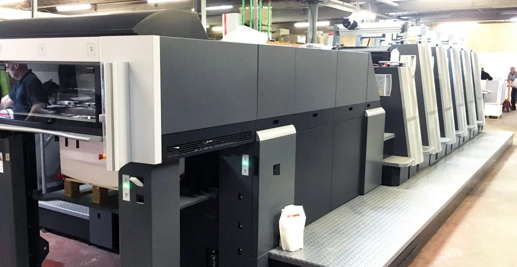
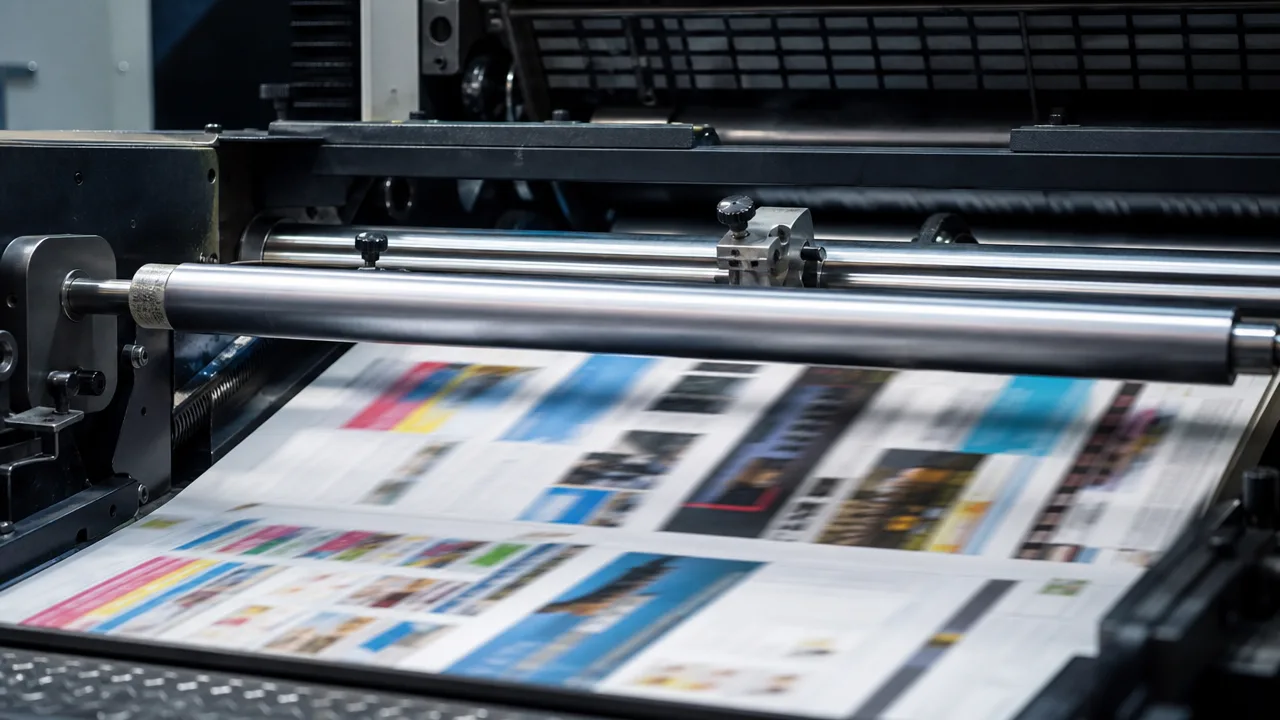
Litho print with Pantone spot colours
B2 Heidelberg presses with spot, metallic and fluorescent inks, colour measured throughout the run.
Explore the servicePantone C and U: coated vs uncoated
Pantone swatches carry a suffix: C for coated paper and U for uncoated. It is the same ink in both cases, but it looks different on each stock. Uncoated paper absorbs more ink, so the colour appears softer and less saturated. Pantone publishes its Formula Guide on both coated and uncoated stock so you can see the difference before you print.
| Your stock | Swatch to check against | What to expect |
|---|---|---|
| Gloss or silk coated paper | Pantone C | Clean, saturated colour close to the coated swatch |
| Uncoated paper (letterheads, some brochures) | Pantone U | Softer, slightly darker colour; brights lose some intensity |
| Both stocks in one suite (for example cards and letterheads) | Both C and U | The colour will not look identical on both; agree an acceptable match for each |
If your stationery runs on uncoated paper and your brochures on coated, ask for proofs on both. We print full brand suites in-house, so the stock, ink and finish can be matched across every item. See our business cards and stationery service.
Colour on digital presses
Digital presses print in CMYK. When a file contains a Pantone colour, the press workflow converts it to the closest CMYK mix. For many brand colours the result is very close, but colours far outside the CMYK range, and all metallics and fluorescents, cannot be matched digitally. Our litho vs digital printing guide explains when each process makes sense.
| What you need | Digital (Heidelberg Versafire, Ricoh) | Litho (Heidelberg XL 75, CX 74) |
|---|---|---|
| Full-colour CMYK | Yes, colour-managed to FOGRA standards | Yes, colour-managed and measured during the run |
| Exact Pantone match | Simulated in CMYK; close for many colours | Yes, printed as a true spot ink |
| Metallic or fluorescent ink | No | Yes |
| Personalised or variable content | Yes, every sheet can be different | No; personalise afterwards |
Whichever process runs your job, we work to recognised standards. Our proofing is calibrated to ISO 12647-2, the international standard for offset print, so the proof you approve is an accurate prediction of the printed result.